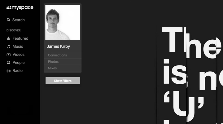
I know most of you will be thinking "Uhh, not another social network to keep track of" but hold out – Although the New Myspace is fairly basic in what it can do at the moment, it still boasts some impressive user interfaces (UI) and has a few feature which make it stand out and differentiate its self from the crowd.
It was a few months ago when Myspace released an incentive to get people on-board to show their interest for the new site. They gave you a video of what the new site would bring, and left you with a box to drop your email in to get a personal invitation. If you gave them your email address, all you had to do was to sit around twiddling your thumbs waiting for that invitation to arrive in your inbox.
Well, now is the time that they've opened the flood gates to the public and started shipping out the invites. They're only letting a limited amount of people in at the moment, but I've been lucky enough to be included in this small selection. They have generously given each new user 8 personal invitations to share with your family and friends, so you might get a nice surprise in your inbox soon.
On first looks of the new social platform I got that "wow" feeling. It has been incredibly creative with its new horizontal scrolling pages and has set the standard for having no vertical content. All the content that would normally be vertically scrollable is laid out flat and to the right – even scrolling with your mouse slides the page to the left, albeit the scrolling is a little slow and trying to grab the scroll bar just above the music player at the bottom can be problematic at times, but these are all things that user testing will iron out.
Myspace's focus has been music for a while now, and as expected one of their biggest features on the new site is a devoted music player located at the bottom of each page. They've managed to get the site to continually play your selected song/mix/playlist/radio station despite letting you navigate around the site simultaneously - a huge achievement as without this, it'd be nothing more than watching a music video on your Facebook/Twitter feed via YouTube.
Even though at first thought you may have thought it's "just another social site", realistically you just need to spend some time using it to realise that it's not only a new, creative and easy to use social platform, but mainly that it creates opportunities for music artists, and not only established artists, but primarily unsigned artists. At this time of writing the Myspace statistics show that there are now 14.2 million artists residing on Myspace. 47k of those are Major artists, 85k are independent artists, and a huge 14 million are unsigned – meaning that the chances of there being quality music on there are pretty high, just don't ask me to sieve through it all!
All-in-all my experience with the new Myspace has been good. It's probably never going to reach the popularity of the likes of Facebook, but I'd place a wager on it being the leader in music social media within the next few years.
